ShopDreamUp AI ArtDreamUp

Deviation Actions


Suggested Deviants


Suggested Collections


You Might Like…


Description
Hello, I'm back after what seems like forever. Some of you may remember the Legion of Superheroes I designed well I recently tweaked or completely overhauled the design on them and thought I'd share the new designs. So what's different? And why the changes well, let me tell you:
Phoenix: The only change on Phoenix is that his hair now comes out through the top of his mask.
Why: I did that because in my original Phoenix sketches he had this plume of feathers that came out from the back of his head so to me he looked empty without something up there. I think the long hair will make images of him in flight look more dramatic anyway.
Dark Bow: No changes were necessary.
Why: Because the design rocked.
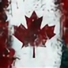
Canadian Shield: Canadian Shield received a dramatic overhaul his new look is much much more armored and slightly more patriotic with added maple leaf logos, he also can carry a lot more gear now with the upgraded utility belt and multiple pockets.
Why: Canadian Shields original suit was very spandex looking, this was never what my vision of him looked like. I've always pictured him as armored so this just matches what I always thought he'd look like.
Shaman: Shaman really just received some design tweaks. The lenses on his mask are now slightly see through, the logo on his chest is completely visible and he has a new cape.
Why: Shaman's design was pretty much perfect the way it was, but I could NOT stand that generic and horrible looking cape. This new one just seems to fit the rest of the design better and gives it that 'over the one shoulder' look much better, you'll notice that none of my characters have that old cape anymore.
Technopath: Technopath is also in the complete overhaul department. The color scheme and general look now is more sleek, less bulky and less armored. The idea here is that his suit is supposed to enhance a power he already has not grant him powers he didn't.
Why: Quite frankly I did not like the old suit much and it reminded me WAAAAAYYYYYYY to much of Cyborg of Teen Titans fame.
Pulse: Once again a complete overhaul, Pulse's clothes, body, face and hair are all different in this one new color scheme to.
Why: Her old design was just ugly, ugly color scheme, design. It also to me didn't scream energy absorption powers, more just generic kung-fu. Her new design is much less butch and more feminine, she's supposed to be a bit of a girly girl but still tough and good at what she does. I think this new look works much better at conveying that, the color scheme here is also supposed to reflect her irish heritage. My only complaint, she looks a bit like April O'Neil.
Icon: The only major change here is the color scheme, and her sun glasses are now slightly see through.
Why: Icon's original colors had to go because I didn't want both female characters wearing green and between the two of them I think Pulse looked better in green. But I think Icon looks much better with this new color scheme.
Phoenix: The only change on Phoenix is that his hair now comes out through the top of his mask.
Why: I did that because in my original Phoenix sketches he had this plume of feathers that came out from the back of his head so to me he looked empty without something up there. I think the long hair will make images of him in flight look more dramatic anyway.
Dark Bow: No changes were necessary.
Why: Because the design rocked.
Canadian Shield: Canadian Shield received a dramatic overhaul his new look is much much more armored and slightly more patriotic with added maple leaf logos, he also can carry a lot more gear now with the upgraded utility belt and multiple pockets.
Why: Canadian Shields original suit was very spandex looking, this was never what my vision of him looked like. I've always pictured him as armored so this just matches what I always thought he'd look like.
Shaman: Shaman really just received some design tweaks. The lenses on his mask are now slightly see through, the logo on his chest is completely visible and he has a new cape.
Why: Shaman's design was pretty much perfect the way it was, but I could NOT stand that generic and horrible looking cape. This new one just seems to fit the rest of the design better and gives it that 'over the one shoulder' look much better, you'll notice that none of my characters have that old cape anymore.
Technopath: Technopath is also in the complete overhaul department. The color scheme and general look now is more sleek, less bulky and less armored. The idea here is that his suit is supposed to enhance a power he already has not grant him powers he didn't.
Why: Quite frankly I did not like the old suit much and it reminded me WAAAAAYYYYYYY to much of Cyborg of Teen Titans fame.
Pulse: Once again a complete overhaul, Pulse's clothes, body, face and hair are all different in this one new color scheme to.
Why: Her old design was just ugly, ugly color scheme, design. It also to me didn't scream energy absorption powers, more just generic kung-fu. Her new design is much less butch and more feminine, she's supposed to be a bit of a girly girl but still tough and good at what she does. I think this new look works much better at conveying that, the color scheme here is also supposed to reflect her irish heritage. My only complaint, she looks a bit like April O'Neil.
Icon: The only major change here is the color scheme, and her sun glasses are now slightly see through.
Why: Icon's original colors had to go because I didn't want both female characters wearing green and between the two of them I think Pulse looked better in green. But I think Icon looks much better with this new color scheme.
Image size
1898x696px 419.7 KB
© 2011 - 2024 Lumit
Comments1
Join the community to add your comment. Already a deviant? Log In
Pretty good!